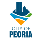
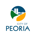
 The City Council on Tuesday night chose a new logo for Peoria to replace the Indian-head logo. The new logo is pictured to the right. It’s blue, green, and yellow, and features silhouettes of the twin towers, Commerce Bank building, and Murray Baker bridge. The city paid Converse Marketing $30,000 to design the new logo.
But the real costs will come later as vehicles, stationery, buildings, etc., all have the logo replaced on them. The city doesn’t have the money for that, so the plan is to phase in the new logo over time. That means we’ll be seeing both logos for a while.
Here’s the official press release:
After months of research, focus groups and committee meetings, the City is asking for your input on a potential logo, designed by Converse Marketing for the City of Peoria. Log on to www.logopeoria.com and review eight logo choices. When you have decided on your favorite, simply click on it. Then choose two more in the same fashion. After selecting three, you will be asked to submit your choices.
A number of logos were presented to the City’s marketing committee for discussion before the final selections were made to City Council Members. Public input is an integral part of the selection process and we encourage everyone to vote.
The voting deadline is October 31, 2008. Please limit your vote to one per person.
And here are the eight choices you have to choose from:
News and Comment about Peoria, Illinois
 The City Council on Tuesday night chose a new logo for Peoria to replace the Indian-head logo. The new logo is pictured to the right. It’s blue, green, and yellow, and features silhouettes of the twin towers, Commerce Bank building, and Murray Baker bridge. The city paid Converse Marketing $30,000 to design the new logo.
